Trends in computing are constantly changing, and one big trend these days is that more and more people are using their mobile devices to accomplish what they might have previously done with their full size computers. Therefore it is important to make sure your website and reservation system displays nicely on mobile devices as well as on traditional laptop and desktop computer based browsers. Larger devices such as iPads and other tablets likely display your regular website without much difficult, but smaller devices such as mobile phones (iPhone, Android, Windows Phone, etc.) might have a harder time since their screens are typically much smaller.
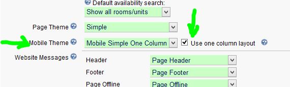
In response the this increasing demand for mobile usage, we have created some new options which make it extremely easy to use your existing Reservation Page on a mobile device. In the Reservation Page settings, we now have a section for selecting which theme to use when your guest is viewing your Reservation Page on a mobile device. To accompanying this, we have created a brand new theme called “Mobile Simple One Column” and an option to display the Reservation Page in one column. Previously all of our different styles of Reservation Pages (multiple units, single unit, hotel, etc.) always used two columns. On a small screen however, it is much more difficult to display two columns since the screens simply are not wide enough. So now you have an option to use a single column system on mobile devices. ReservationKey will automatically detect when a guest is using a mobile device and change to the theme you have set as your mobile theme.
To set this up, go to Website Tab, Reservation Pages, and edit. Go to the themes section (near the top), and select which theme to use for mobile. We highly recommend using the new Single Column theme, and make sure you check the box to use the One Column Layout.
Once you have saved these settings, this is all you have to do to turn your existing page into a page that is nicely formatted for mobile use. Now, when a guest visits your Reservation Page with their mobile device they will automatically see the mobile version. Of course, we recommend testing your page on a mobile device and that you make any changes necessary to improve the guest experience.
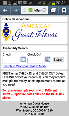
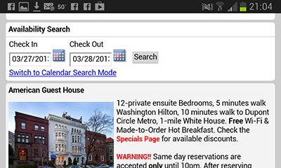
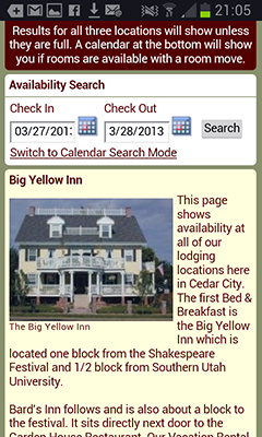
The mobile interface starts by asking the guest to enter their dates.
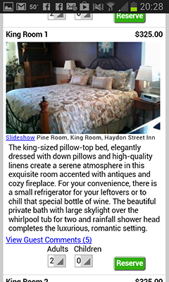
After clicking Search, the rooms are displayed.
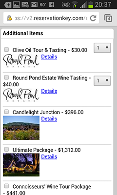
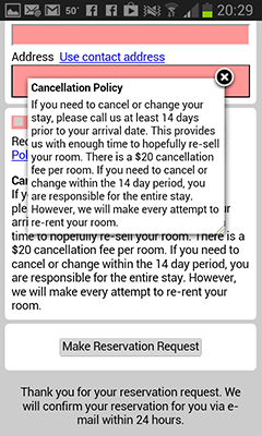
Once one room is selected, the page will automatically scroll down to the Items for Sale section, or the Reservation Summary if no items are listed.
Then the guest continues scrolling down to complete the reservation form.
The system also works well in landscape mode.
Of course, you might want to edit the look and feel of the mobile version, and that is possible just like we do for the normal themes. Simply load the new Mobile Simple Single Column theme in the Themes and edit as you like.
As always, we will continue to tweak this feature as we receive feedback, and as technology changes.