Design | January 21, 2026 | 4 min read
New Modern Booking Page Themes
ReservationKey now offers six new modern booking page themes designed for hotels, B&Bs, vacation rentals, and campgrounds (and more!). These themes feature cleaner layouts, responsive mobile design, accessibility improvements, and flexible customization options to better match your website’s look and feel.
We’re excited to announce the release of six brand-new booking page themes in ReservationKey. These new themes give your reservation pages a cleaner, more modern look while improving usability across desktop, tablet, and mobile devices.
Whether you run a hotel, bed & breakfast, vacation rental, or campground, these themes are designed to adapt to your business type, your website’s style, and your guests’ booking behavior.
A Smarter, More Flexible Booking Layout
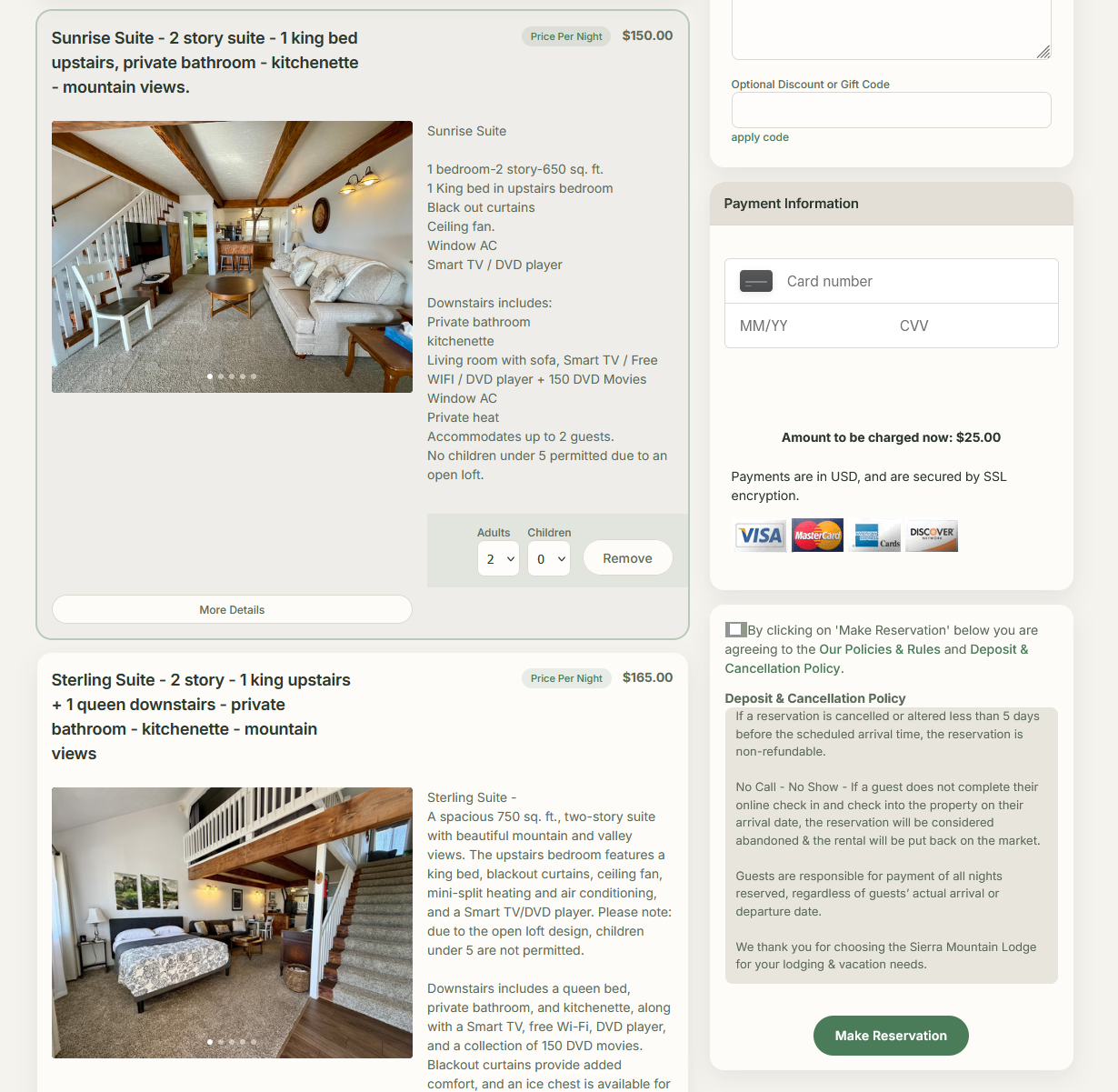
One of the biggest improvements in the new themes is how the booking flow adapts as guests move through the process.
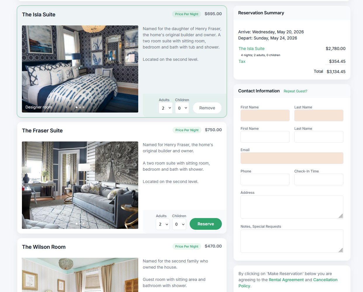
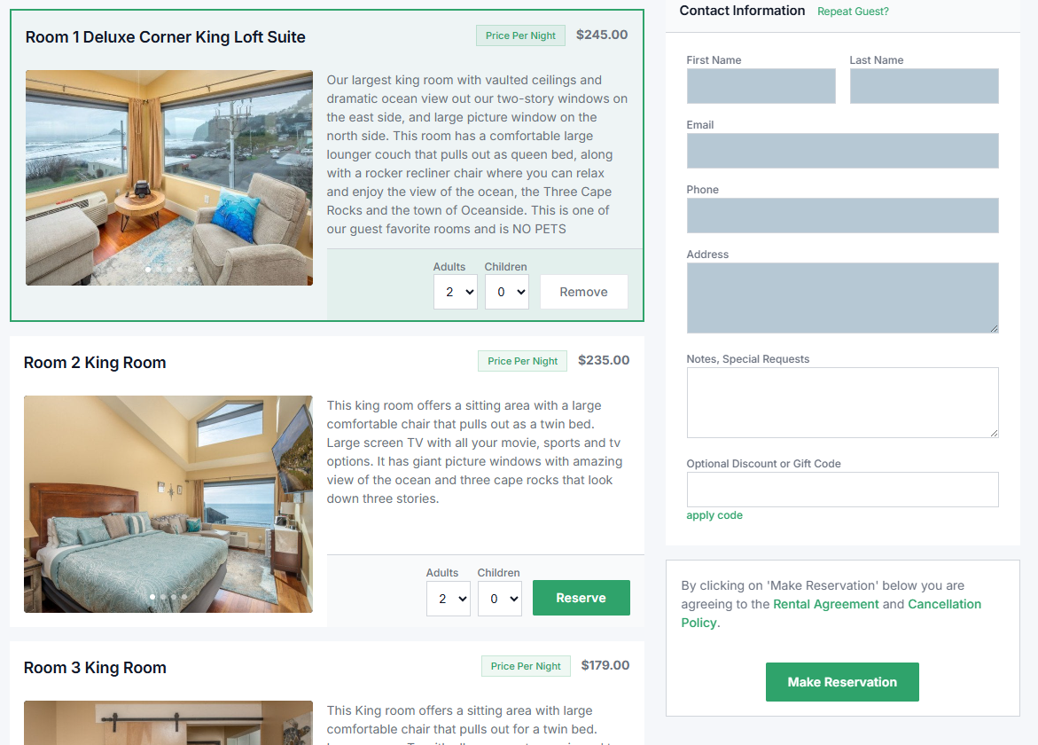
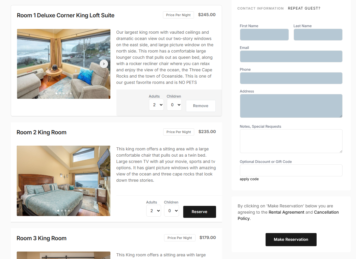
On larger screens, the booking page starts in a single, wide column, keeping the experience clean and easy to scan. Once a guest selects a room or unit, the layout smoothly transitions into a two-column view, showing a clear reservation summary, contact details, and payment information alongside the selected room.
On mobile devices, everything stacks into a single-column layout, ensuring the booking experience stays fast, intuitive, and easy to use on smaller screens.
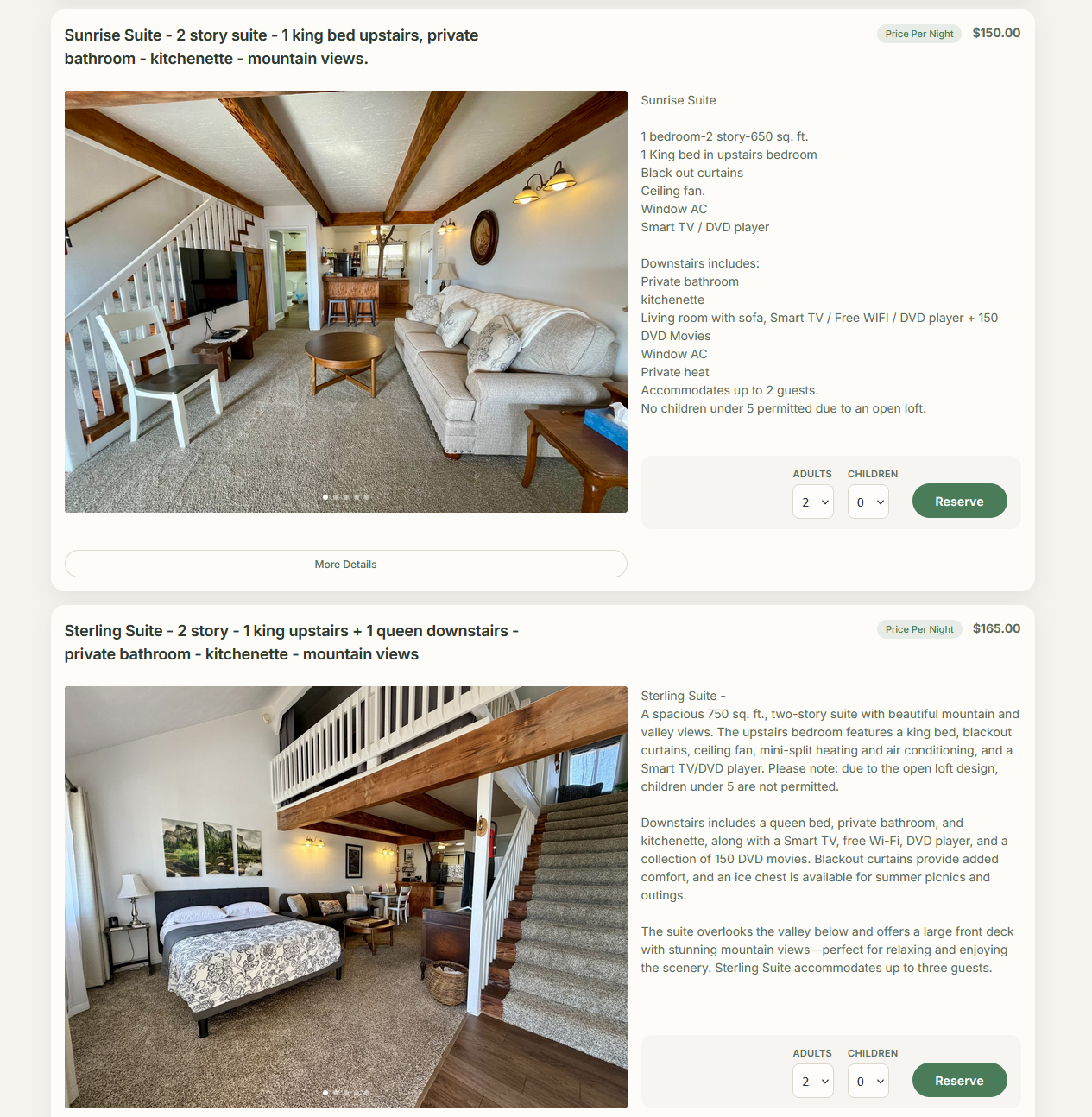
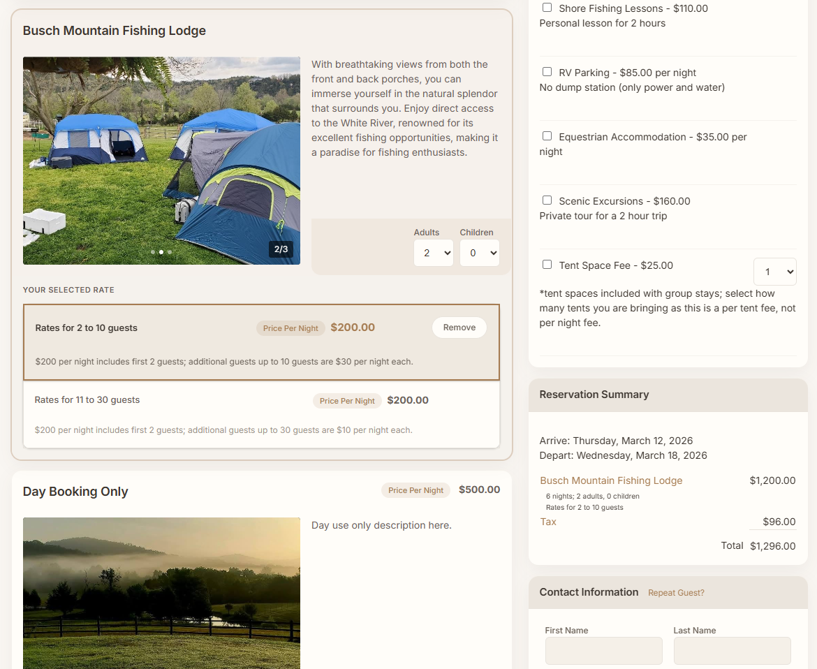
The Six New Booking Page Themes
We’ve added six new presentation themes, each designed with a distinct visual style and use case in mind.
Modern Default (New Standard Theme)
This is the new default theme for all new reservation pages. It features a clean layout, subtle color accents, and a modern visual hierarchy that works well for nearly any property type.
Warm Hospitality
Designed with bed & breakfasts and boutique properties in mind, this theme uses warmer tones and softer styling to create a welcoming, personal feel.
Sharp Flat
This theme removes rounded corners and leans into crisp edges and clean lines. It’s a great option for properties that prefer a more structured, modern, or corporate look.
Minimal Editorial
For those who prefer a truly minimalist design, this theme strips away unnecessary borders, shadows, and visual noise. Flat colors and clean spacing keep the focus entirely on the booking flow.
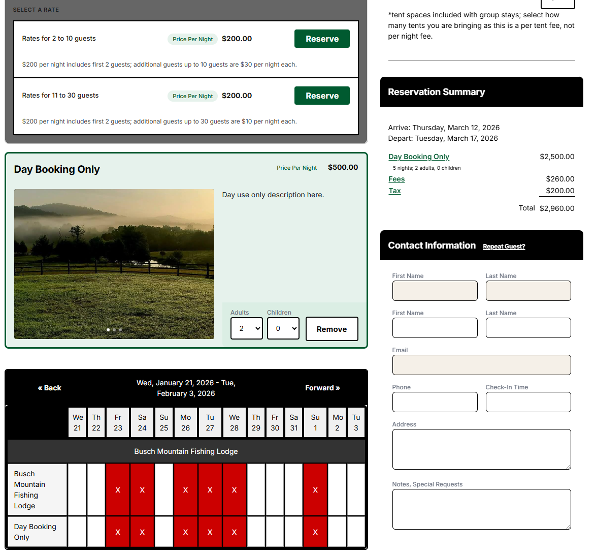
Accessible (High Contrast)
Accessibility matters. This high-contrast theme increases readability by using darker borders, stronger contrast, and simplified color combinations. It’s ideal for guests with limited color perception or anyone who prefers a more readable interface.
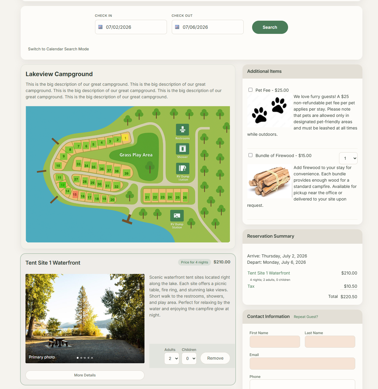
Nature / Outdoor
Perfect for campgrounds and outdoor properties, this theme uses earth-toned colors like greens and browns to match the surrounding environment and create a natural, outdoors-focused feel.
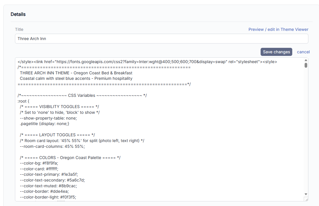
Built-In Customization Options
All six themes can be easily customized to better match your website’s branding. Without any custom coding, you can:
- Change colors and accents
- Adjust field highlight and required field colors
- Show or hide page titles
- Show or hide the property overview block
- Fine-tune spacing and layout details
Required field indicators now use a modern slate-style color by default, but this can be changed at any time through the reservation form settings.
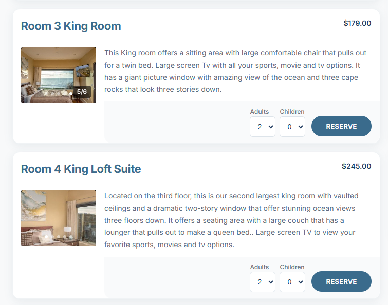
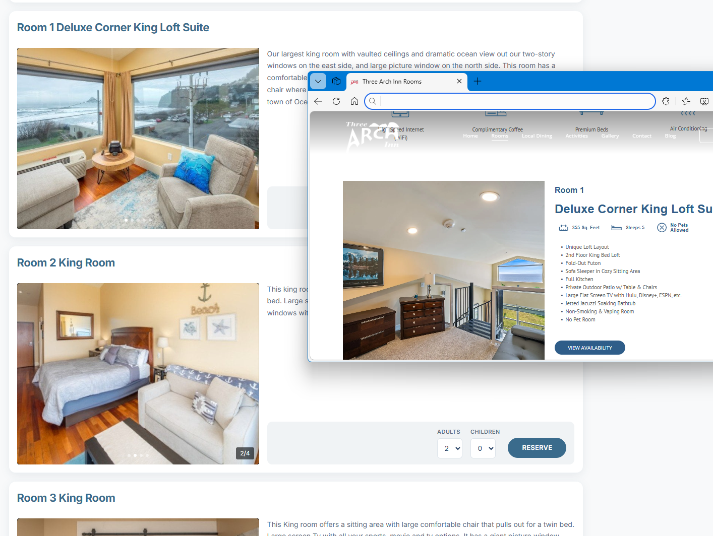
Ad_justable Photo and Description L_ayouts
Each theme allows you to control the layout balance between photos and descriptions. By default, photos display at 60% width with descriptions at 40%, but this can be easily changed to:
- 50% / 50%
- 40% / 60%
- Or other supported ratios
This makes it easy to emphasize visuals or text depending on your property and content.
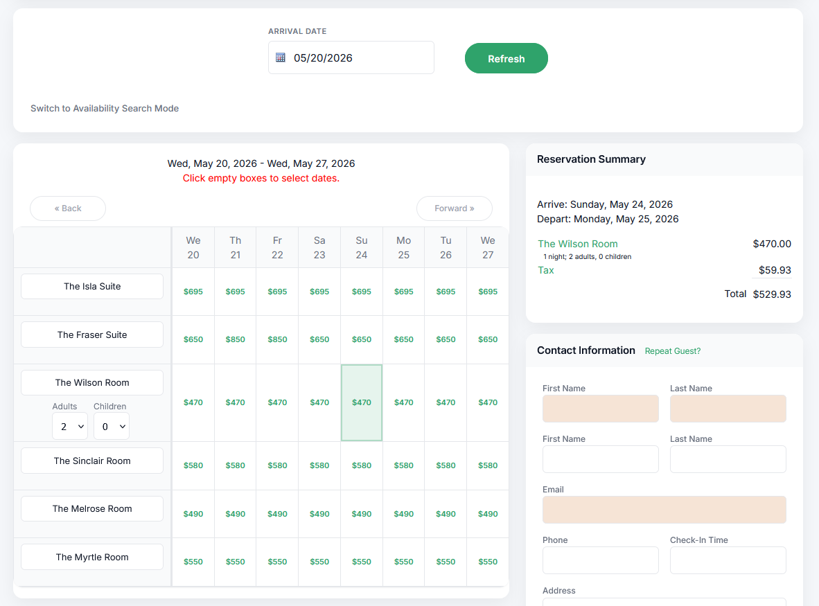
Campground Maps and Property Blocks
For campground and outdoor properties, the property block plays an important role. When enabled, it can display overview images, descriptions, and interactive maps. If your campground uses a map, keeping this block visible allows guests to click directly on available sites.
Fully Customized Themes That Match Your Website
In addition to the built-in themes, we’ve also made it easy to fully customize a theme to match your existing website. By pulling colors, fonts, and spacing directly from your site, we can transform the Modern Default theme into a booking page that feels like a seamless extension of your brand.
Legacy Themes Remain Available
For existing accounts, legacy themes remain available. While older themes may feel heavier or darker compared to modern design trends, you’re always free to continue using them if they work best for your property.
That said, the new themes reflect a broader move toward lighter, cleaner, and more readable booking experiences.
Try the New Themes Today
The best way to decide which theme works for you is to try them out. Switch between themes, experiment with layout options, and customize the look until it feels right for your website and your guests.
As always, if you have special requests or would like help customizing a theme further, just let us know—we’re happy to help.